![]()
![]()
MODIS
wxee is designed for processing weather data, but it can also be useful for remote sensing data. In this example, we’ll look at how wxee can work with data from the MODIS sensor, and also get a glimpse of how we can create color composite plots from xarray objects.
Setup
[ ]:
!pip install wxee
[1]:
import ee
import wxee

ee.Authenticate()
wxee.Initialize()
Downloading MODIS to xarray
We’ll start by loading 6 months of MODIS Terra 8-day reflectance images and selecting the red, green, blue, and NIR bands.
[2]:
ts = wxee.TimeSeries("MODIS/006/MOD09A1").filterDate("2020-03", "2020-09")
ts = ts.select(["sur_refl_b01", "sur_refl_b04", "sur_refl_b03", "sur_refl_b02"])

ts.describe()
MODIS/006/MOD09A1
        Images: 23
        Start date: 2020-03-05 00:00:00 UTC
        End date: 2020-08-28 00:00:00 UTC
        Mean interval: 8.00 days
MODIS imagery is unbounded, so we need to specify a region when we convert it to an xarray.Dataset. We’ll select Madagascar from a collection of country polygons.
[3]:
countries = ee.FeatureCollection("FAO/GAUL_SIMPLIFIED_500m/2015/level0")
madagascar = countries.filterMetadata("ADM0_NAME", "equals", "Madagascar")
Now we’ll download the TimeSeries collection to an xarray.Dataset.
[4]:
ds = ts.wx.to_xarray(region=madagascar.geometry().bounds(), scale=10_000, crs="EPSG:29702")
Visualizing MODIS Data
Plotting multispectral color composites can be tricky in xarray, but wxee has a convenient rgb method that creates plots RGB from our Dataset bands, faceted over the time dimension. Just use the wx accessor on your xarray object to access the rgb method.
We’ll apply a quick percentile stretch to get a nice looking image, and the rest of the arguments will be passed to our plotting function.
[5]:
ds.wx.rgb(stretch=0.98, col_wrap=8, size=4, aspect=0.5)
[5]:
<xarray.plot.facetgrid.FacetGrid at 0x7f4b452cda60>
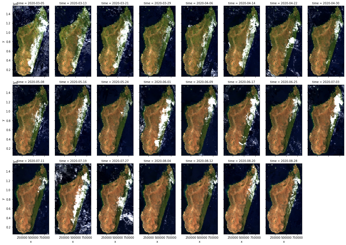
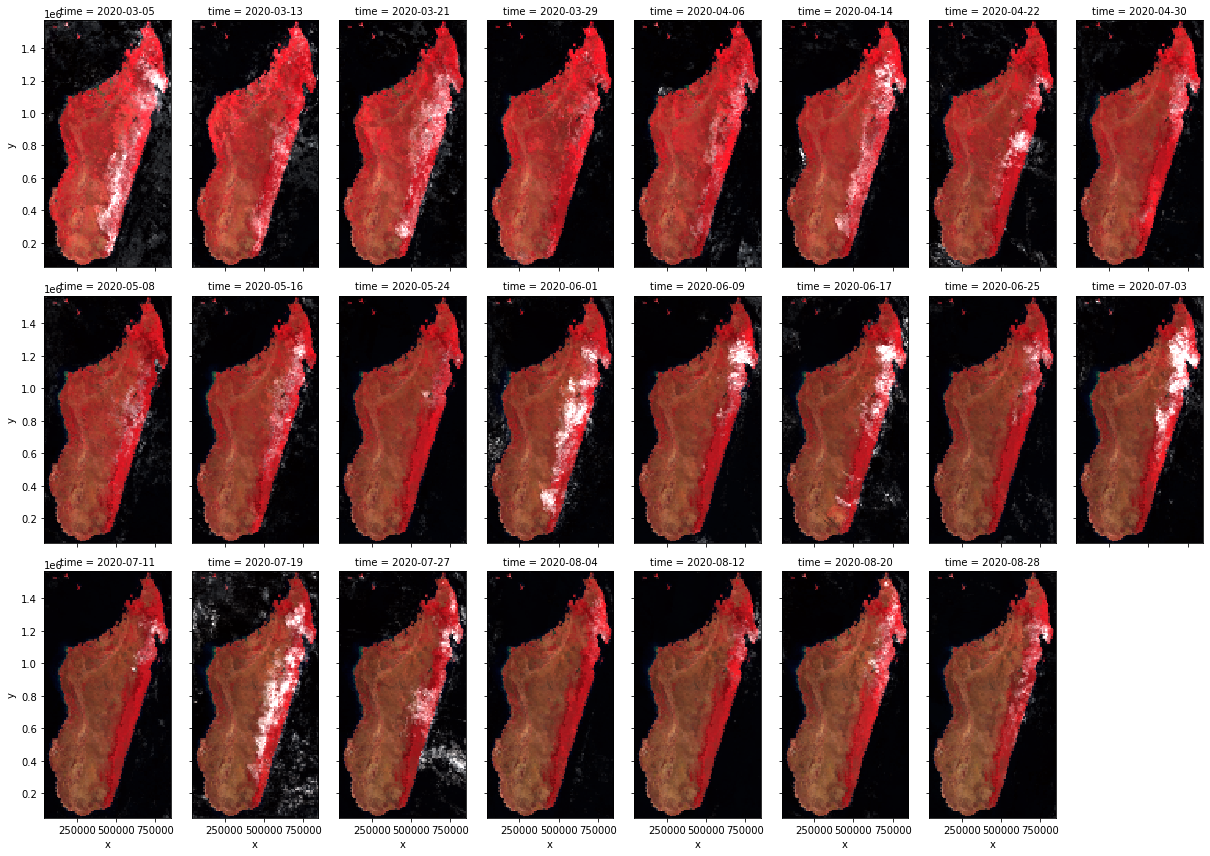
As you can see, the images above are natural color composites. That’s because we downloaded the bands in the R, G, B, NIR order. The rgb method defaults to using the first three bands as the red, green, and blue channels. If we want a false color composite, we can specify a bands argument in whatever order we want. Let’s do NIR, R, G instead.
[6]:
bands = ["sur_refl_b02", "sur_refl_b01", "sur_refl_b04"]

ds.wx.rgb(bands=bands, stretch=0.995, col_wrap=8, size=4, aspect=0.5)
[6]:
<xarray.plot.facetgrid.FacetGrid at 0x7f4b3d2fdb20>
Interactive Plots
By default, the rgb method creates static plots. We can create interactive plots using hvplot, which is an optional dependency of wxee. First, make sure it’s installed, and then call rgb with the interactive argument.
[ ]:
!pip install hvplot
[7]:
ds.wx.rgb(stretch=0.98, interactive=True, frame_width=200, aspect=0.5)
[7]:
Note
This page was auto-generated from a Jupyter notebook. For full functionality, download the notebook from Github and run it in a local Python environment.