![]()
![]()
Fire Progressions
wxee is designed for processing weather data, but it can also be useful for remote sensing data. In this example, we’ll look at how wxee can work with data from the GOES-16 and MODIS to visualize fire progressions over time.
Setup
[ ]:
!pip install wxee
[1]:
import ee
import wxee

ee.Authenticate()
wxee.Initialize()
Daily Progressions from MODIS
One of the products captured by the MODIS sensor is fire hotspot detections. We’ll use wxee to load daily hotspots for the 2021 Caldor fire in California and visualize them by the time of burning.
Downloading MODIS Data to xarray
To start with, we’ll load 14 days of MODIS data as a TimeSeries.
[2]:
modis = wxee.TimeSeries("MODIS/006/MOD14A1").filterDate("2021-08-15", "2021-09-05").select("FireMask")

modis.describe()
MODIS/006/MOD14A1
        Images: 21
        Start date: 2021-08-15 00:00:00 UTC
        End date: 2021-09-04 00:00:00 UTC
        Mean interval: 1.00 days
The FireMask band contains codes indicating the confidence of fire detections. First, we’ll use map to turn those codes into binary images of fire presence, copying properties over so we don’t lose any time information.
[3]:
fire_masks = modis.map(lambda img: img.eq(9).copyProperties(img, img.propertyNames()))
Now we’ll specify a bounding box around the Caldor fire and download the TimeSeries to an xarray.Dataset.
[4]:
region = ee.Geometry.Polygon(
        [[[-120.70580745719522, 38.90798203224902],
          [-120.70580745719522, 38.51793451346024],
          [-119.90014827750772, 38.51793451346024],
          [-119.90014827750772, 38.90798203224902]]]
)

ds = fire_masks.wx.to_xarray(scale=1000, region=region, crs="EPSG:26910")
Visualizing the Progression
The result will be 14 binary fire masks. Let’s take a look.
[5]:
ds.FireMask.plot(col="time", col_wrap=7)
[5]:
<xarray.plot.facetgrid.FacetGrid at 0x7f85bec59130>
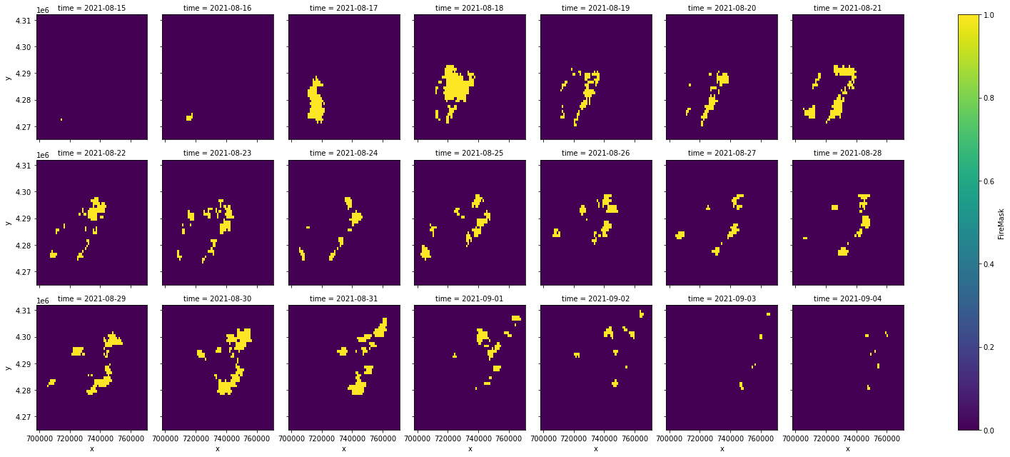
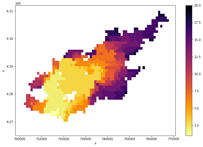
That shows us how the fire grew over time, but maybe we want a single summary image describing that progression. Let’s calculate the first day that a given pixel burned. Rather than storing specific times, we’ll represent them as time elapsed since the beginning of the time series.
First, get the start time of the time series and calculate the number of hours elapsed between each time step and the start time.
[6]:
start = ds.time.min()
delta_days = (ds.time - start).dt.days
Now, we’ll multiply the time delta by the fire mask. Because non-fire pixels have a value of 0, this will give us a 3D array with elapsed days since start for each hotspot pixel and values of 0 for all other pixels. We cast from a timedelta to an int to allow plotting.
[7]:
delta_days_fire = (ds.FireMask * delta_days).astype(int)
Finally, we can mask non-hotspot pixels (values of 0) and take the minimum over time to get the first time, in days elapsed since start, that each pixel burned.
[8]:
first_burned = delta_days_fire.where(delta_days_fire != 0).min("time")
And of course, plot it!
[9]:
first_burned.plot(size=8, cmap="inferno_r")
[9]:
<matplotlib.collections.QuadMesh at 0x7f85ada61af0>
Hourly Progressions from GOES-16
Unlike MODIS which captures daily hotspots, GOES-16 captures hotspots every 5 minutes! This is great for tracking fast-moving fires, but it also means we have to deal with a lot more data. We can use wxee and the aggregate_time method to aggregate those 5-minute hotspots to hourly hotspots.
Downloading GOES-16 data to xarray
First, we’ll load GOES-16 data over a time window that experienced explosive fire growth in the Western Cascades of Oregon in 2020.
[10]:
ts = wxee.TimeSeries("NOAA/GOES/16/FDCC").select("Mask").filterDate("2020-09-08", "2020-09-09")
ts.describe("minute")
NOAA/GOES/16/FDCC
        Images: 288
        Start date: 2020-09-08 00:01:16 UTC
        End date: 2020-09-08 23:56:16 UTC
        Mean interval: 5.00 minutes
Like with MODIS, we’ll have to convert mask codes to a binary fire mask. For GOES, we’ll use the codes 10, 11, 30, and 31.
[11]:
def fire_mask(img):
    mask = ee.Image(0).rename("fire")
    mask = (mask
        .where(img.eq(10), 1)
        .where(img.eq(11), 1)
        .where(img.eq(30), 1)
        .where(img.eq(31), 1)
    )
    # Copy the properties from the original images to avoid losing time data.
    return mask.copyProperties(img, img.propertyNames())

# Convert each mask class image into a binary fire presence mask
fire_masks = ts.map(lambda img: fire_mask(img))
Now we can aggregate the 288 5-minute masks to 24 hourly masks. We’ll use a max reducer, meaning that an hourly hotspot was detected at least once within the hour.
[12]:
hourly_fire = fire_masks.aggregate_time("hour", reducer=ee.Reducer.max())
hourly_fire.describe("minute")
NOAA/GOES/16/FDCC
        Images: 24
        Start date: 2020-09-08 00:01:16 UTC
        End date: 2020-09-08 23:01:16 UTC
        Mean interval: 60.00 minutes
Select a region around the largest 2020 fire, Beachie Creek.
[13]:
geom = ee.Geometry.Polygon(
    [[[-122.77807114256022, 45.370803623985665],
      [-122.77807114256022, 44.519360582318896],
      [-121.46520493162272, 44.519360582318896],
      [-121.46520493162272, 45.370803623985665]]]
)
And download the data to an xarray.Dataset.
[14]:
ds = hourly_fire.wx.to_xarray(region=geom, scale=2_000, crs="EPSG:26910")
Visualizing the Progression
Like before, we’ll convert our time series of fire masks into a single image showing when each area burned in time elapsed.
[15]:
start = ds.time.min()
# Convert milliseconds to hours
delta_hours = (ds.time - start) / 3_600_000_000_000

delta_hours_fire = (ds.fire * delta_hours).astype(int)

first_burned = delta_hours_fire.where(delta_hours_fire != 0).min("time")
And plot it!
[16]:
first_burned.plot(size=8, cmap="inferno_r")
[16]:
<matplotlib.collections.QuadMesh at 0x7f85bc3f40a0>
Note
This page was auto-generated from a Jupyter notebook. For full functionality, download the notebook from Github and run it in a local Python environment.