![]()
![]()
Combining wxee and eemont
eemont is a Python package that adds powerful functionality like cloud masking and spectral index calculation to Earth Engine classes. Because TimeSeries in wxee are a subclass of ee.ImageCollection, any methods from eemont that work with an ImageCollection will also work with a TimeSeries!
In this tutorial, we’ll see how we can combine the two packages by generating monthly aggregates of cloud-masked NDVI data from MODIS.
Setup
[ ]:
# !pip install wxee
# !pip install eemont
[1]:
import ee
import wxee
import eemont

ee.Authenticate()
wxee.Initialize()
Creating a Time Series
First, we’ll load one year of daily imagery from the MODIS sensor as a TimeSeries.
[2]:
modis = wxee.TimeSeries("MODIS/006/MOD09GA").filterDate("2020", "2021")
Pre-Processing with eemont
Now, we’ll use eemont to mask clouds and calculate the Normalized Difference Vegetation Index (NDVI) of each image in the time series. For more details, see the eemont documentation on cloud masking and spectral indices.
[3]:
ts = (modis
      .maskClouds(maskShadows=False)
      .scaleAndOffset()
      .spectralIndices(index="NDVI")
      .select("NDVI")
)
Monthly Aggregation
Now we’ll aggregate our daily cloud-masked NDVI images to monthtly medians.
[4]:
monthly_ts = ts.aggregate_time("month", ee.Reducer.median())
Before we download our data, we’ll clip the MODIS images to a country layer in order to remove areas of ocean.
[5]:
countries = ee.FeatureCollection("FAO/GAUL_SIMPLIFIED_500m/2015/level0")
monthly_ts_land = monthly_ts.map(lambda img: img.clip(countries))
Downloading the Time Series
Finally, we’re ready to specify a region of interest around the African continent.
[6]:
region = ee.Geometry.Polygon(
    [[[-20.94783493615687, 38.550044216461366],
      [-20.94783493615687, -36.736958952789465],
      [53.58341506384313, -36.736958952789465],
      [53.58341506384313, 38.550044216461366]]]
)
And download our TimeSeries to an xarray.Dataset!
[7]:
ds = monthly_ts_land.wx.to_xarray(region=region, scale=20_000)
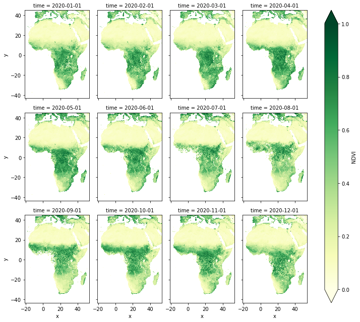
Visualizing the Time Series
The Easy Way
An xarray.Dataset can be easily plotted by arranging it into columns along the time dimension.
[8]:
ds.NDVI.plot(col="time", col_wrap=4, cmap="YlGn", vmin=0, vmax=1, aspect=0.8)
[8]:
<xarray.plot.facetgrid.FacetGrid at 0x7f5a58fa2520>
The Fun Way
If we want a more exciting visualization, we can use the hvplot library and its xarray module to create time series animations!
[ ]:
# !pip install hvplot
[9]:
import hvplot.xarray
import holoviews as hv
[10]:
hv.extension("bokeh")
ds.NDVI.hvplot(
    groupby="time", clim=(0, 1), cmap="YlGn",
    frame_height=600, aspect=0.8,
    widget_location="bottom", widget_type="scrubber",
)
[10]:
Note
This page was auto-generated from a Jupyter notebook. For full functionality, download the notebook from Github and run it in a local Python environment.