![]()
![]()
Temporal Interpolation
In this tutorial, we’ll take a look at the TimeSeries.interpolate_time and TimeSeries.insert_image methods in wxeeto see how they can be used to fill missing data.
Setup
[ ]:
!pip install wxee
[1]:
import ee
import wxee

ee.Authenticate()
wxee.Initialize()
Interpolating Data
Interpolation allows you to synthesize data between existing data points. In this case, we’ll interpolate gridded precipitation data between daily outputs from the gridMET model.
To begin with, we’ll create a TimeSeries object of daily precipitation data.
[2]:
ts = wxee.TimeSeries("IDAHO_EPSCOR/GRIDMET").select("pr")
We could interpolate directly from this time series which contains data between 1979 and present, but it will run faster if we subset our time series around our period of interest.
Let’s select 2 days of data in January of 1985.
[3]:
ts_sub = ts.filterDate("1985-01-26", "1985-01-28")

ts_sub.describe("day")
IDAHO_EPSCOR/GRIDMET
        Images: 2
        Start date: 1985-01-26 06:00:00 UTC
        End date: 1985-01-27 06:00:00 UTC
        Mean interval: 1.00 days
Now we’ll use linear interpolation to predict rainfall at 18:00 UTC on June 28. Because our TimeSeries data is acquired daily at 06:00 UTC, this will be interpolated halfway between our two existing grids.
[4]:
target_time = ee.Date("1985-01-26T18")
interp = ts_sub.interpolate_time(target_time, method="linear")
The TimeSeries.interpolate_time method returns the interpolated image. If we want to add the interpolated data back into our time series, we can use the TimeSeries.insert_image method.
[5]:
ts_interp = ts_sub.insert_image(interp)
ts_interp.describe("day")
IDAHO_EPSCOR/GRIDMET
        Images: 3
        Start date: 1985-01-26 06:00:00 UTC
        End date: 1985-01-27 06:00:00 UTC
        Mean interval: 0.50 days
Notice that we now have three images instead of two, and the mean daily interval has decreased. Let’s download our time series and take a look at the synthesized data.
[6]:
ds = ts_interp.wx.to_xarray(scale=20_000, crs="EPSG:5070")
[7]:
ds.pr.plot(col="time", aspect=1.4, size=4, vmin=0, vmax=40)
[7]:
<xarray.plot.facetgrid.FacetGrid at 0x7f26535bdd00>
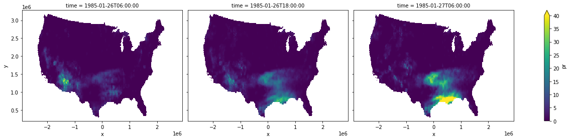
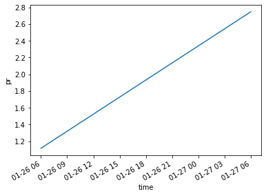
It’s a bit hard to tell, but our predicted 18:00 UTC precipitation is linearly interpolated between our existing data points. That should be a little clearer if we look at the mean precipitation over the United States.
[8]:
ds.pr.mean(["x", "y"]).plot()
[8]:
[<matplotlib.lines.Line2D at 0x7f2638be6940>]
Comparing Interpolation Methods
To compare the results of different interpolation methods, we’ll see how their predictions compare by synthesizing missing data and comparing the predictions to real data.
To start off with, we’ll load 4 months of temperature data around (but not including) July of 2005. We’ll also load the missing July data as a separate image.
[9]:
ts_missing = wxee.TimeSeries([
    "ECMWF/ERA5_LAND/MONTHLY/200505",
    "ECMWF/ERA5_LAND/MONTHLY/200506",
    # Skip July
    "ECMWF/ERA5_LAND/MONTHLY/200508",
    "ECMWF/ERA5_LAND/MONTHLY/200509",
]).select("temperature_2m").map(lambda img: img.rename("actual"))


missing_month = ee.Image("ECMWF/ERA5_LAND/MONTHLY/200507").select("temperature_2m").rename("actual")
Now we’ll iterate over our interpolation methods, creating a TimeSeries from each by filling in July using interpolate_time and adding it back to the time series using insert_image. We’ll set their band names to help us track which is which and merge each into an empty TimeSeries so that we can download them in one go.
[10]:
fill_date = ee.Date("2005-07")

ts = wxee.TimeSeries([])

for method in ["nearest", "linear", "cubic"]:
    interp_july = ts_missing.interpolate_time(fill_date, method)
    ts_interp = ts_missing.insert_image(interp_july).map(lambda img: img.rename(method))

    ts = ts.merge(ts_interp)
Finally, we’ll insert the actual July data into the TimeSeries.
[11]:
ts = ts.merge(ts_missing.insert_image(missing_month))
Now we can download the TimeSeries containing our interpolated and actual data and visualize our predictions. We’ll do this within a region we define around Iceland.
[12]:
region = ee.Geometry.Polygon(
        [[[-74.89613274249616, 84.1363940126967],
          [-74.89613274249616, 58.87152610826001],
          [-7.923476492496146, 58.87152610826001],
          [-7.923476492496146, 84.1363940126967]]])

ds = ts.wx.to_xarray(region=region)
First off, let’s just look at the July temperature grids we created with each method.
[13]:
ds.sel(time="2005-07").to_array().plot(col="variable")
[13]:
<xarray.plot.facetgrid.FacetGrid at 0x7f2638b46d90>
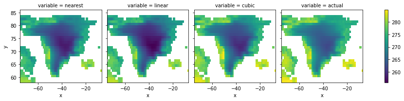
It looks like cubic was the closest to actual July data, but it’s hard to tell from a map. Instead, we’ll compare mean temperatures over the region between methods.
[14]:
ds.mean(["x", "y"]).to_array().plot(hue="variable")
[14]:
[<matplotlib.lines.Line2D at 0x7f26381cf220>,
 <matplotlib.lines.Line2D at 0x7f2638170f70>,
 <matplotlib.lines.Line2D at 0x7f263817d100>,
 <matplotlib.lines.Line2D at 0x7f263817d1f0>]
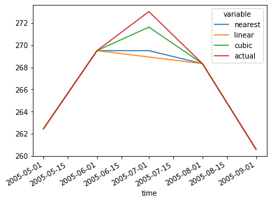
Now it’s clear: cubic clearly came the closest to the actual data, but it still underestimated temperatures.
Note
This page was auto-generated from a Jupyter notebook. For full functionality, download the notebook from Github and run it in a local Python environment.