![]()
![]()
Temporal Aggregation
In this tutorial, we’ll use wxee to aggregate time series image collections over time. Image collections can be aggregated to monthly, weekly, daily, and hourly frequencies, but the input data must have finer temporal resolution than the output (e.g. daily data can be aggregated to weekly, but not vice versa).
Setup
[ ]:
!pip install wxee
[1]:
import ee
import wxee

ee.Authenticate()
wxee.Initialize()
Create a Time Series
Time-based methods in wxee, like temporal aggregation and climatology, work with the TimeSeries subclass of ee.ImageCollection. To use them, we’ll need to create a TimeSeries. There are two ways to do this.
From an Image Collection
Create an ee.ImageCollection and use the wx accessor and the to_time_series method to convert the Image Collection to a TimeSeries.
[2]:
rtma = ee.ImageCollection("NOAA/NWS/RTMA")
ts = rtma.wx.to_time_series()
From Scratch
As a shortcut, you can create a TimeSeries just like you would create an ee.ImageCollection. Just pass a collection ID or list of Images.
[3]:
ts = wxee.TimeSeries("NOAA/NWS/RTMA")
Aggregate Hourly to Daily
Now that we have out time series, let’s get two days of wind velocity grids. The collection should contain 48 images–one per hour.
[4]:
ts = ts.filterDate("2020-09-08", "2020-09-10").select("WIND")
This is a good time to introduce the wxee.TimeSeries.describe() method, which simply prints out some helpful information about our time series. As expected, we have 48 images and the mean interval between images is 1 hour.
[5]:
ts.describe(unit="hour")
NOAA/NWS/RTMA
        Images: 48
        Start date: 2020-09-08 00:00:00 UTC
        End date: 2020-09-09 23:00:00 UTC
        Mean interval: 1.00 hours
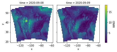
Now we’ll aggregate hourly data to daily data. By default, aggregate_time uses ee.Reducer.mean() to aggregate data, so the output will represent average daily wind speeds. The 48 hourly input images have been aggregated into 2 daily images.
[6]:
daily = ts.aggregate_time(frequency="day")
daily.describe()
NOAA/NWS/RTMA
        Images: 2
        Start date: 2020-09-08 00:00:00 UTC
        End date: 2020-09-09 00:00:00 UTC
        Mean interval: 1.00 days
Now we can download and visualize the daily data.
[7]:
x = daily.wx.to_xarray()
x.WIND.plot(col="time")
[7]:
<xarray.plot.facetgrid.FacetGrid at 0x7f456e718fd0>
Aggregate Daily to Monthly
gridMET contains daily temperature data. We’ll load a time series with one year of data from 2020, giving us 366 images (2020 was a leap year).
[8]:
gridmet = wxee.TimeSeries("IDAHO_EPSCOR/GRIDMET").select("tmmx")
gridmet = gridmet.filterDate("2020-01", "2021-01")
gridmet.describe()
IDAHO_EPSCOR/GRIDMET
        Images: 366
        Start date: 2020-01-01 06:00:00 UTC
        End date: 2020-12-31 06:00:00 UTC
        Mean interval: 1.00 days
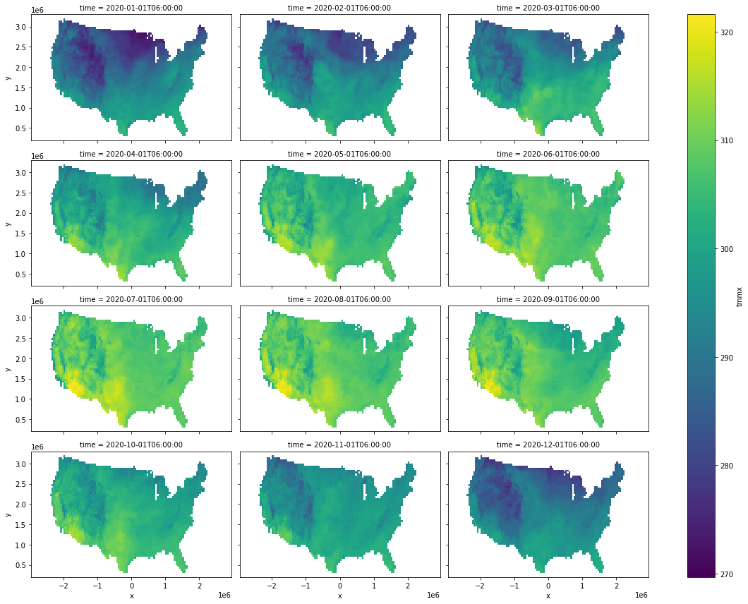
Now, we’ll calculate the monthly maximum temperatures, download them an xarray dataset, and plot them by month.
[9]:
monthly = gridmet.aggregate_time(frequency="month", reducer=ee.Reducer.max())

x = monthly.wx.to_xarray(scale=50_000, crs="EPSG:5070")
x.tmmx.plot(col="time", col_wrap=3, figsize=(16, 12))
[9]:
<xarray.plot.facetgrid.FacetGrid at 0x7f456e70bac0>
Note
This page was auto-generated from a Jupyter notebook. For full functionality, download the notebook from Github and run it in a local Python environment.