![]()
![]()
Color Composites
Remotely sensed imagery often contains data from multiple spectral bands, and multi-band color composites help us visualize that data by assigning a different color to each band. wxee makes it easy to generate static or interactive color composites from xarray datasets using the rgb method.
Setup
Setup is similar to other tutorials with one exception. Interactive plots rely on hvplot which is an optional dependency of wxee, so make sure that’s installed.
[ ]:
!pip install wxee
!pip install hvplot
[1]:
import ee
import wxee

ee.Authenticate()
wxee.Initialize()
Downloading a Dataset
To demonstrate the rgb method, we’ll download a time series of multispectral data from Sentinel-2 over Spirit Lake, Washington. When Mount St. Helens erupted in 1980, trees from the surrounding forest were blown into Spirit Lake. Many of them still float there, pushed back and forth by seasonal winds. That should make for an interesting time series!
[2]:
geom = ee.Geometry.Polygon(
        [[[-122.18605629604276, 46.304892727612064],
          [-122.18605629604276, 46.243667518203395],
          [-122.09301582973417, 46.243667518203395],
          [-122.09301582973417, 46.304892727612064]]])
First, we’ll create a one-month time series of Sentinel-2 data over the lake, selecting the visible, NIR, and SWIR bands. We’ll filter by cloud cover to get rid of any images that are too cloudy.
[3]:
ts = (wxee.TimeSeries("COPERNICUS/S2_SR")
    .select(["B4", "B3", "B2", "B8", "B11"])
    .filterDate("2020-08", "2020-09")
    .filterBounds(geom)
    .filterMetadata("CLOUDY_PIXEL_PERCENTAGE", "less_than", 20))
And download to an xarray dataset at 20m resolution.
[4]:
ds = ts.wx.to_xarray(region=geom, scale=20)
Visualization
The rgb Method
Let’s see how the rgb method works by accessing it through the wx accessor and running it with default settings.
[5]:
ds.wx.rgb()
[5]:
<xarray.plot.facetgrid.FacetGrid at 0x7f82ddf1e820>
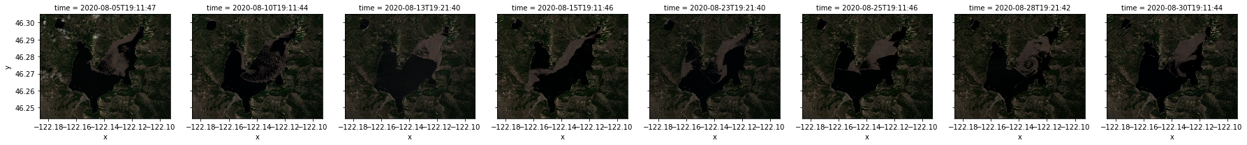
Each of the 8 images in our time series if plotted, automatically faceted by the time dimension. They’re a little dark and a little small, so let’s fix that.
Stretching and Other Parameters
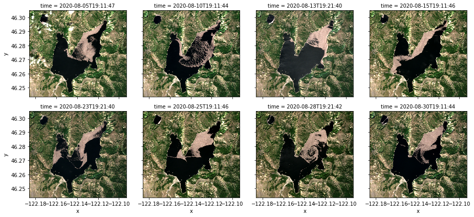
The stretch parameter applies a percentile stretch that can make it easier to see details. Also, rgb accepts any keyword arguments and passes them along to the plotting function–in this case, xarray.Dataset.plot–so we’ll use the col_wrap parameter to make the plots a little larger. Other parameters for the plotting function can be found here.
[6]:
ds.wx.rgb(stretch=0.99, col_wrap=4)
[6]:
<xarray.plot.facetgrid.FacetGrid at 0x7f83307987c0>
Much better! But what bands is it using?
Specifying Band Combinations
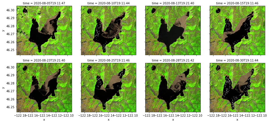
By default, the rgb method takes the first 3 bands in order as the red, green, and blue channels. Because we downloaded our Sentinel-2 imagery with red, green, blue, NIR, and SWIR bands (in that order), we’re seeing a true color composite. We can modify that by passing a list of 3 bands to the bands parameter. Let’s try SWIR-NIR-Red.
[7]:
bands = ["B11", "B8", "B4"]

ds.wx.rgb(bands=bands, stretch=0.99, col_wrap=4)
[7]:
<xarray.plot.facetgrid.FacetGrid at 0x7f82ce222d60>
Interactive Plots
So far we’ve just looked at static plots, but rgb can also create interactive plots using the interactive argument. With an interactive plot, additional arguments are passed to xarray.DataAarray.hvplot.rgb, so we no longer need col_wrap. Instead, we’ll specify an aspect and a frame_width to change the aspect ratio and size of the plot. More details on the hvplot arguments can be found here.
[8]:
bands = ["B11", "B8", "B4"]

ds.wx.rgb(bands=bands, stretch=0.99, interactive=True, aspect=1.2, frame_width=600)
[8]:
Note
This page was auto-generated from a Jupyter notebook. For full functionality, download the notebook from Github and run it in a local Python environment.